User-Centric Engineering: A Case Study in Design & Engineering
While leading the Technical and Design front for TEDx Horizon at Graphic Era (Graphic Era University). That's when something unexpected happened. The Graphic Era Group noticed my approach – this user-centric design philosophy that's been my engineering compass for the past 3 years.
They were impressed, and next thing I knew, I was collaborating with them on some exciting projects. Many might view design as pure artistry, fueled by gut feeling. But for me, there's a science to it too. Especially when you're dealing with software – you want it to be intuitive, almost an extension of the user's mind.
That's the challenge the Graphic Era Group threw my way: create solutions that were technically sound but also felt natural to use.
Here are some of the flagship solutions I engineered and designed, along with the user-centric principles that guided my development process:
Graphic Era Flagship Website
December 2023
63475 views
Graphic Era Flagship Website
December 2023
63475 views
Graphic Era Flagship Website
December 2023
63475 views
Graphic Era Flagship Website
December 2023
63475 views
As the quote says, "Scientifically or intuitively, there are hundreds of design decisions made by someone obsessing over the tiniest margins so that when they work, no one has to think about it." That's the essence of user-centric design – creating seamless experiences that feel natural and intuitive. Understanding the "why" behind these seemingly simple decisions not only elevates our design skills but also fosters a deeper appreciation for the craft.

Take a simple example: reaching for a light switch in the dark. Our brains naturally understand proximity – objects close together are perceived as connected. This same principle translates to the digital world through -Fitts' Law.
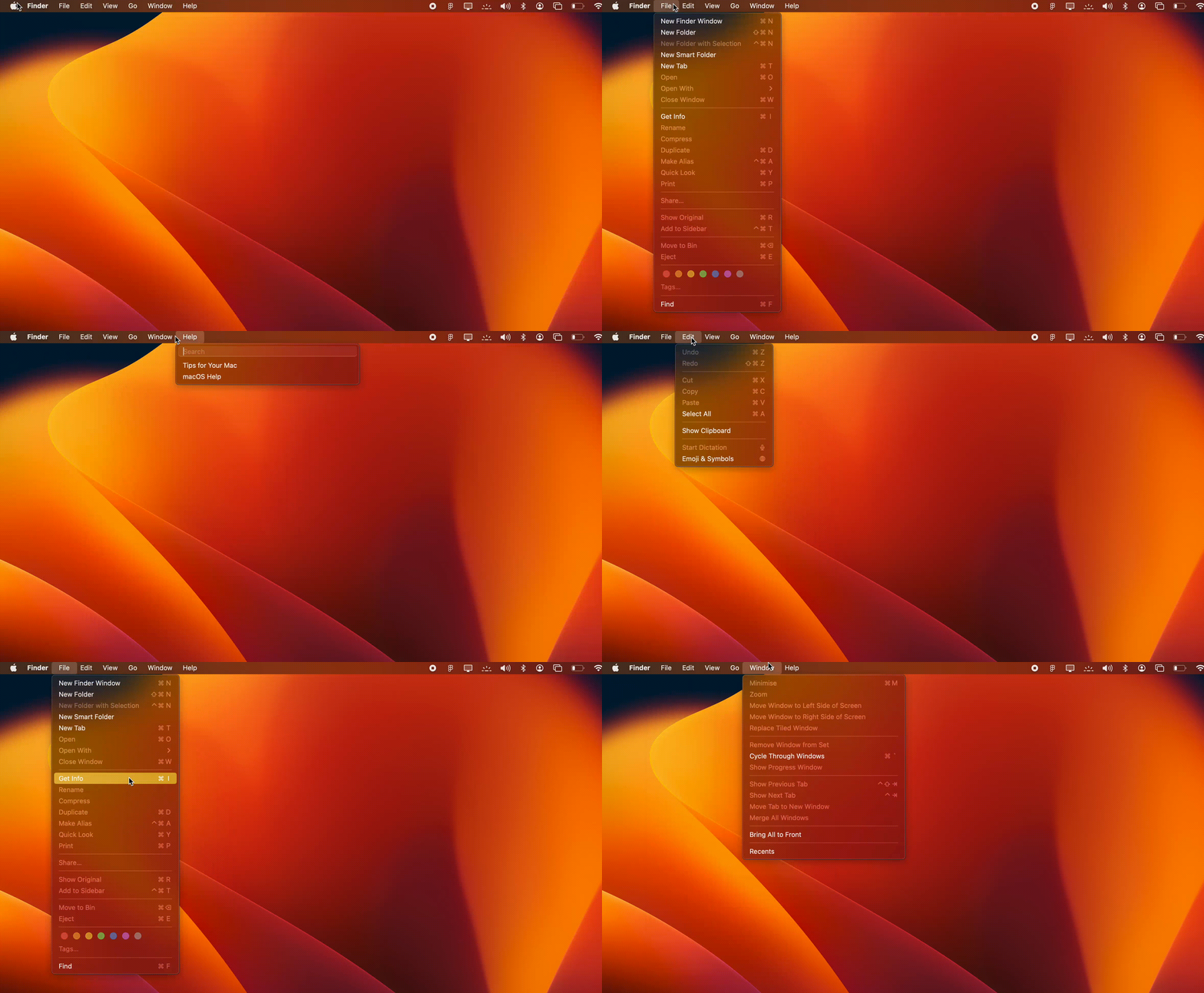
A perfect example of -Fitts' Law in action is the MacBook menubar. Imagine you're working on a document and urgently need to save your progress. Following Fitts' Law, I, as a designer, would ensure the "Save" button within the application window is prominently sized and positioned near the top of the screen. This minimizes the distance your hand needs to travel on the trackpad or the time it takes to move your mouse to click the button.

But it's not just about physical closeness. Imagine staring at a menu overflowing with choices. -Hick's Law explains why this can be overwhelming. The more options you present, the longer it takes users to make a decision. So, I streamlined menus and options, giving users only the most relevant choices at any given time.
In the end, it's not just about making things look pretty – it's about creating seamless experiences that feel natural. Understanding the "why" behind these seemingly simple decisions elevates design skills and fosters a deeper appreciation for the craft.
Acknowledgements
Thanks to Pulkit Mahajan, Aman Jagdev & Akshat Goel for reading early drafts and their insights and feedback.
No artificial intelligence was used to generate content for this essay.